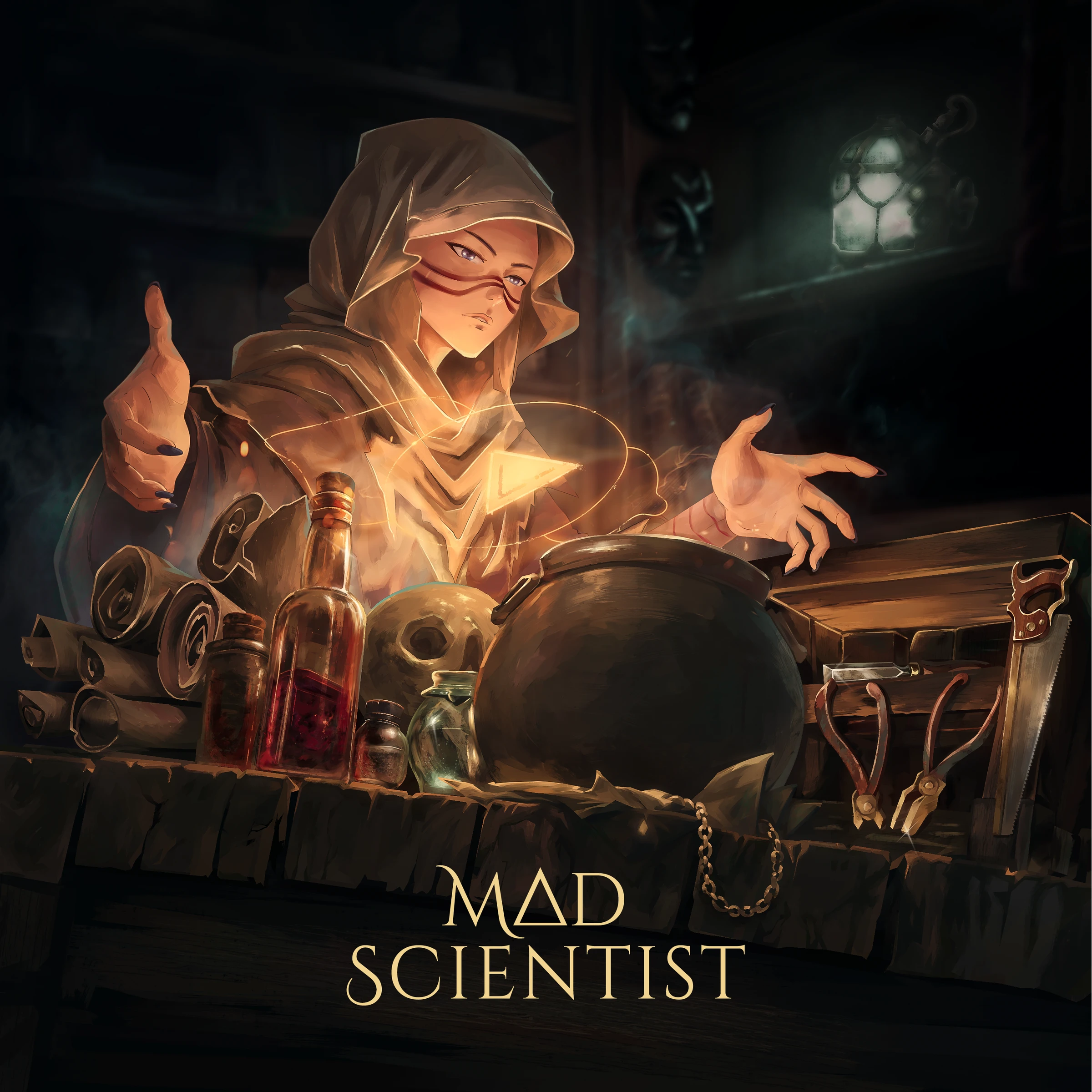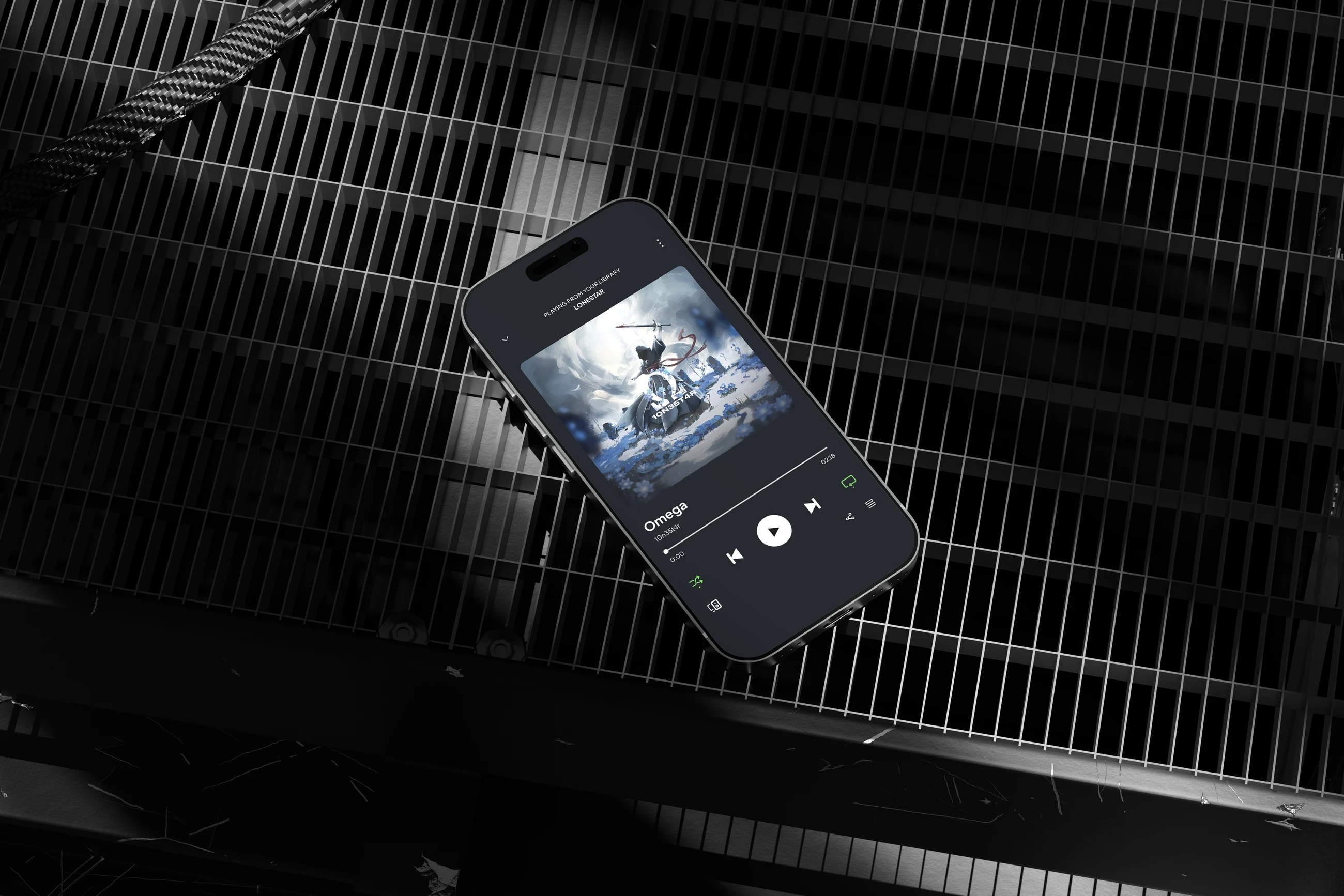
Ω (Omega) was developed as part of 10n35t4r’s wider visual lore, where the same character appears across different releases. Instead of treating the album cover as an isolated image, I built the artwork as one part of a larger visual system.
The package expanded the main artwork into platform adaptations, social media content, custom mockups, and merchandise. The direction was developed through several sketch options and refined together with the artist before moving into the final artwork.
Album artArt directionCharacter loreRelease designMerchandise
Client
My role
Graphic designer and visual artist.
Concept development, illustration, cover design, visual adaptations, merchandise, mockups, and final production.
Duration
Tools
23
Assets delivered across the release package
4
Weeks from concept to final delivery
Overview
The initial brief called for an epic scene: a monk standing in an open landscape, raising a staff or sword as lightning strikes around him. The main challenge was to turn that simple direction into artwork that could also belong to the artist’s existing visual lore.
I developed the composition around a central robed figure, a dramatic sky, and an open environment. The final scene keeps the character as the focal point while leaving enough visual space for the atmosphere and typography to work together.
Concept and art direction
I explored 2–3 sketch directions before selecting the composition that best matched the release and its audience. The chosen direction placed the character against a large storm-filled sky, with the raised sword creating a strong vertical gesture and focal point.
The environment was kept open rather than overloaded with ruins, allowing the scene to feel more atmospheric and giving the character room to dominate the composition.
Visual system
I chose a monochrome blue palette to reinforce the dramatic atmosphere of the scene. Blue became the main visual accent across the artwork, balancing the dark character silhouette against the bright storm and surrounding landscape.
The recurring character also became an important part of the visual system. The same figure and visual language can continue across future releases, helping connect individual artworks into a larger narrative.
Release applications
The main artwork was adapted beyond the cover itself, including social media posts and stories, streaming-focused mockups, and promotional visuals.
I also developed merchandise applications using elements from the artwork, including a T-shirt, CD packaging, and additional promotional mockups.
Merch adaptation
The cover was rebuilt as a back print rather than placed on a shirt as-is. The painted scene was reduced to a single light ink on black — the robed figure and the raised sword kept as a silhouette with tone, the storm and landscape dropped — so it holds on fabric at print resolution and at a distance.
The Ω became the centre of a custom blackletter monogram, with the sword running through it as the letter’s spine, and mirrored heraldic silhouettes were ghosted behind the figure in a darker grey to give the print width without competing with it. A small copyright line closes the composition at the bottom.
Process and delivery
The project was developed through a presentation-led workflow. Sketches, visual references, colour directions, design options, and final variations were presented throughout the process so the artist could review and select the direction at each stage.
Final delivery included the cover files, merchandise files, mockup files, presentation materials, and the completed case-study PDF for the artist’s reference.
What was delivered
A 3000×3000 px album cover and a complete release design package containing 23 assets.
The package included platform adaptations, social media content, custom streaming and promotional mockups, merchandise artwork, and production-ready files.