TAKE OVER! — Hydrakuma13 × AfterDRK
An aggressive visual built around energy and perspective
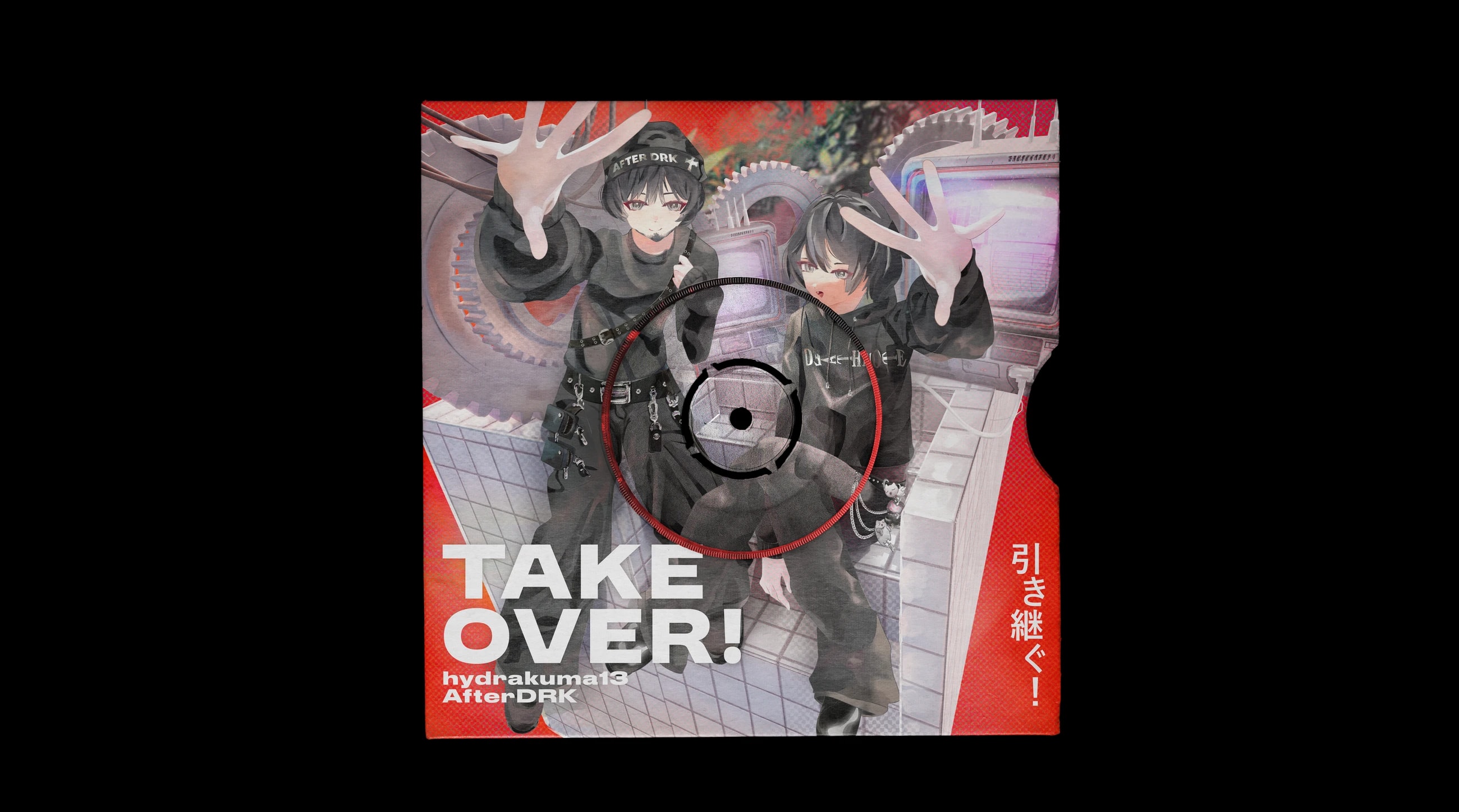
The brief was open-ended: the cover needed to feel energetic and immediately grab attention, but there was no fixed visual direction. I translated that into an aggressive composition built around a vivid red background, high-contrast white typography, and bold type with enough visual weight to anchor the image.
I built a custom 3D environment to establish the perspective and give the artwork a stronger sense of depth. The characters reaching toward the viewer became the main spatial device, pushing the composition beyond a flat cover and creating a more dynamic, immersive feel.
Cover artArt direction3D graphicsTypographyVisual composition
Client
My role
Graphic designer and visual artist.
Concept development, composition, typography, and final artwork production.
Duration
Tools
3000×3000
Final cover artwork resolution
5
Supporting assets delivered with the cover
Overview
The project started without a defined visual concept. The main requirement was energy — the artwork needed to feel aggressive, immediate, and visually intense.
I developed the direction around a combination of retro-computing references, Japanese visual culture, mechanical forms, and a strong red-and-white graphic language.
Visual direction
Red became the dominant background colour, creating an immediate sense of intensity, while white typography provided a sharp visual contrast. The heavy type treatment also acts as a structural element, helping lock the composition together.
The 3D environment introduces the retro-computing atmosphere through old CRT-style screens, gears, cables, and mechanical structures. Together, these elements create a nostalgic early-2000s / Akiba-inspired visual world.
Composition and perspective
Instead of placing the characters into a flat background, I constructed a spatial environment around them to control perspective and depth.
The characters’ hands reaching toward the viewer became a key compositional device. This perspective breaks the boundary between the artwork and the viewer, adding movement and making the cover feel more immediate.
What was delivered
A 3000×3000 px final single cover with the complete visual composition, typography, 3D environment, and character integration.
Five supporting assets were also prepared for the project, keeping the visual language consistent beyond the main cover.