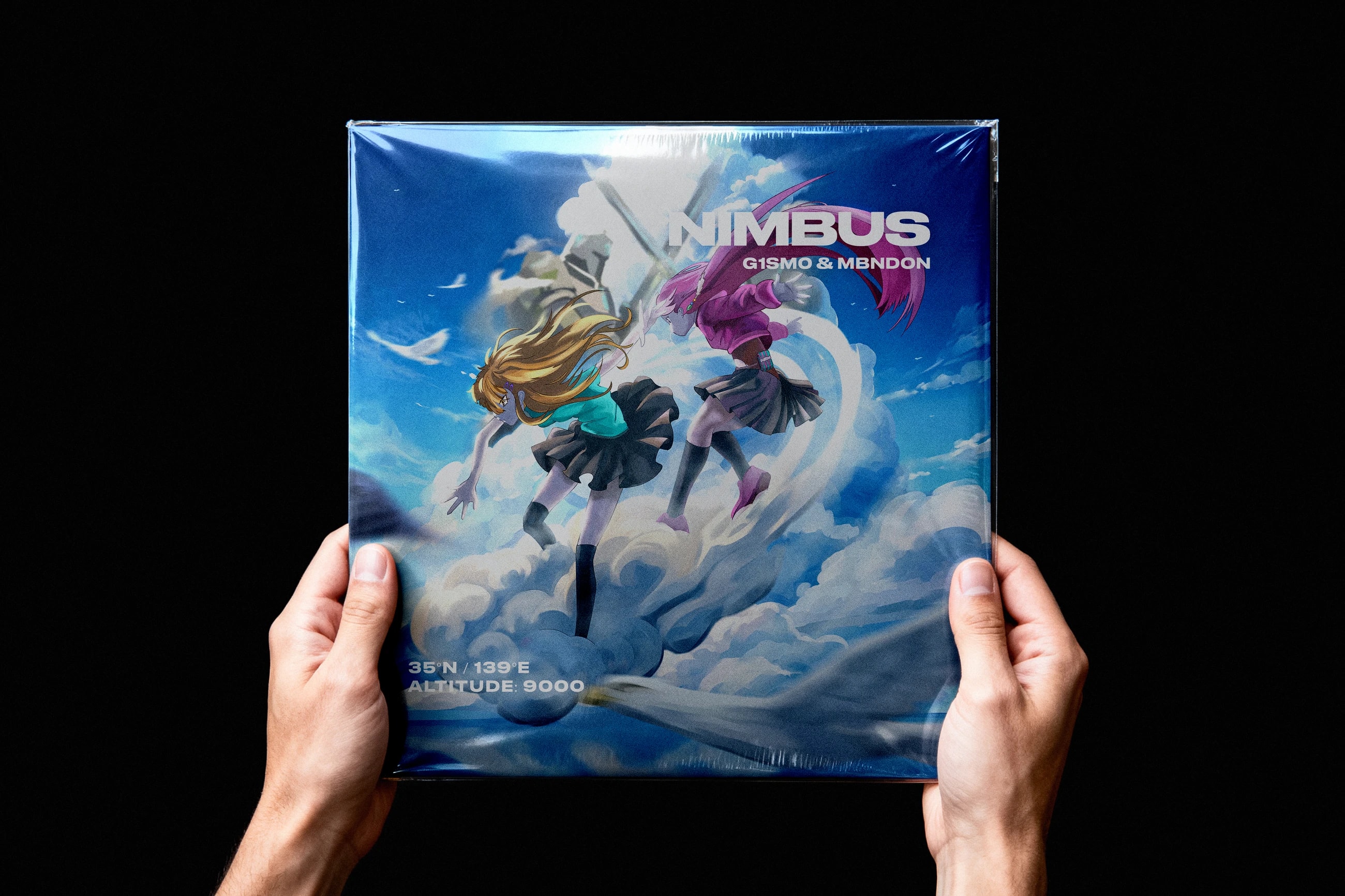
Nimbus is an EP cover built around a dynamic fantasy scene: two characters riding through the clouds while enormous surreal figures clash in the distance. The direction combines anime-inspired illustration with a sense of movement, scale, and playful surrealism.
The project was developed as a complete EP design package rather than a standalone cover. I handled the visual concept, illustration, colour exploration, typography, platform adaptation, mockups, and layered source delivery so the artwork could also be reused for future motion work.
Cover artIllustrationArt directionColour directionRelease system
Client
My role
Designer and illustrator.
Concept development, illustration, composition, typography, colour exploration, mockups, and final asset preparation.
Duration
Tools
3000×3000
Final master cover resolution in pixels
13
Delivered assets across the EP package
Overview
The core concept was to show two characters moving through the sky on a cloud, creating a strong sense of speed and freedom. During the brainstorming stage, we pushed the scene further by introducing surreal giants fighting in the background, adding scale and a more unexpected visual layer.
The additional figures created a clear compositional challenge: they could easily compete with the two main characters and weaken the visual hierarchy. Instead of removing the idea, I adapted their placement, scale, and integration into the environment so the scene could retain its surreal character without losing its main point of focus.
The business context
The project was developed as an EP design package for G1SM0 and Mbn.Don and was licensed through NCS (NoCopyrightSounds) and InternetSounds, an NCS sub-label. This required the artwork to work not only as a creative image, but also as a release-ready visual asset across digital platforms and promotional contexts.
Because the cover would exist across multiple formats, the artwork was developed with adaptation in mind from the beginning. The final delivery included platform mockups and layered source material that could be reused for future promotional or animated content.
Research and discovery
The visual direction was developed through brainstorming around three main ideas: dynamic movement, surreal scale, and an anime-inspired fantasy atmosphere. The cloud-riding scene became the central visual device, while the background giants were treated as a secondary layer that expands the world rather than becoming the main subject.
For the giants, I used the opening scene of Black Myth: Wukong as a visual reference for their monumental presence and distant confrontation. The reference was used to guide scale and atmosphere while keeping the final composition specific to the Nimbus concept.
Key decisions
I developed the composition from an early sketch into the final painted artwork, preserving the movement of the two characters while refining the cloud shapes, background scale, and directional flow.
Three colour variants were prepared during development. This gave the client a direct comparison of different colour directions before the final palette was selected, making the visual decision part of the design process rather than a fixed assumption.
Typography was integrated directly into the composition to establish a strong title hierarchy without interrupting the movement of the scene. Additional location and altitude information was used as supporting graphic information, reinforcing the sense of place and height.
The final artwork was built in layers and delivered in a form that could be adapted later for animation. This preserved the separation between major visual elements instead of locking the release artwork into one flattened image.
What was delivered
The final 3000×3000 px master cover was delivered together with the layered artwork and supporting assets. The package contained 13 assets in total.
I prepared presentation and platform adaptations, including streaming, physical CD, and vinyl mockups. These demonstrate how the same artwork functions across both digital and physical release contexts.
The final package was prepared for further promotional use, with source material structured so the artwork could be adapted into motion and additional campaign formats without rebuilding the scene from scratch.