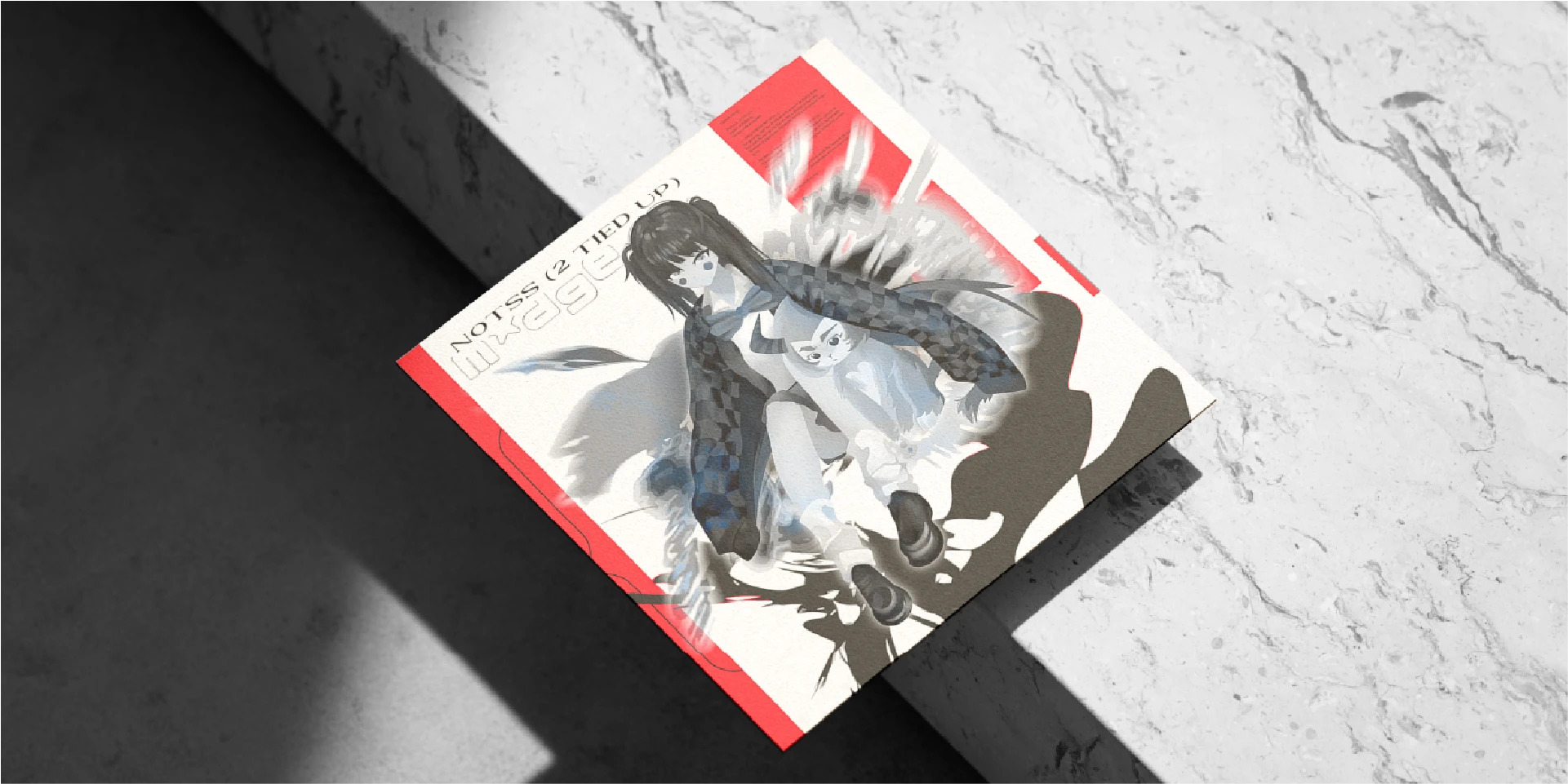
Madge approached the project with a track originally titled “2 TIED UP” under the NOTSS name, later renamed “Sloppy.” The visual direction needed to feel experimental and distinctive, without relying on a conventional cover-art structure.
I combined an abstract visual composition with experimental typography, using a monochrome palette to create a focused and unconventional visual identity around the release.
Cover artAbstract artExperimental typographyMonochromeVisual direction
Client
My role
Graphic designer and visual artist.
Concept development, artwork, typography, composition, and final production.
Duration
Tools
3000×3000
Final cover artwork resolution
3
Supporting assets delivered with the cover
Overview
The project began as the visual direction for “2 TIED UP” by NOTSS, later renamed “Sloppy.” The goal was to create artwork that matched Madge’s experimental approach while remaining visually strong as a standalone release cover.
I focused the direction on the relationship between abstract imagery and typography, treating both as equally important parts of the composition.
Visual direction
The artwork was developed around a monochrome visual language, keeping the palette restrained so the composition, texture, and typography could carry the visual impact.
The abstract artwork gives the cover an unconventional and slightly ambiguous character, while the typography introduces structure and a recognisable graphic element.
Typography and composition
Rather than using typography as simple information placed over the artwork, I treated it as part of the visual composition itself.
Experimental type treatments were used to complement the abstract imagery and create a visual language aligned with the artist’s aesthetic.
What was delivered
A 3000×3000 px final single/EP cover combining the abstract artwork and experimental typographic treatment.
Three supporting assets were also delivered for use alongside the main release artwork.